ROLE
Product Designer
UX Researcher
TIMELINE
3 Months
TOOLS
Figma, FigJam,
Maze
TYPE
Self-Initiated
Enterprise SaaS
PROJECT AT A GLANCE
Problem
ServiceDesk Plus is powerful but painful to use. IT agents waste significant time scanning cluttered queues, switching between disconnected modules, and hunting for information that should be one click away.
Solution
A redesign focused on three things: clarity of information hierarchy, streamlined ticket workflows, and a dashboard that surfaces what matters, without adding new features or removing existing ones.
Impact
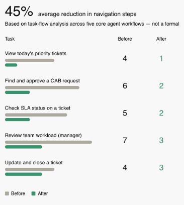
Estimated 45% improvement in task efficiency based on reduced navigation steps and simplified ticket triage. Before/after task flow analysis showed a reduction from 6+ steps to 3 or fewer for the most common agent actions.


DETAILED CASE STUDY
01 - PROBLEM
IT agents spend more time managing the tool than solving actual problems.
ServiceDesk Plus serves IT support teams at organizations of all sizes. It handles ticket management, scheduling, and reporting. The functionality is there, but the interface makes it hard to use.
From my audit, agents faced three consistent friction points: they couldn't scan their workload at a glance, they had to navigate between multiple disconnected screens to complete single tasks, and the visual design gave equal weight to everything, making it impossible to prioritize.
The result: slower resolution times, more context switching, and a tool that feels like work to use.
🎯 DESIGN QUESTION:
"How might we redesign ServiceDesk Plus so IT agents can triage, act on, and resolve tickets with fewer steps and less cognitive load — without disrupting the workflows they already know?"
02 - UX AUDIT
Where the interface fights its users
I started by mapping where the existing interface was fighting its own users.
Before touching Figma, I spent time using the live ServiceDesk Plus interface and documenting friction points screen by screen.
Inconsistent iconography, no visual hierarchy, and every category looked equally important.
Dense, unfiltered table. No priority signalling. Agents had to mentally sort everything.
Inconsistent iconography, no visual hierarchy, and every category looked equally important.
Poor contrast made icons and cards blend into the background — harder to use, not easier.
MOST CRITICAL FINDING
Completing a single common task, reviewing an urgent ticket, checking its status, and updating it — required navigating across three separate screens.
->
->
03 - COMPETITIVE ANALYSIS
How Freshservice and Zendesk got it right

I looked at how Freshservice and Zendesk handle the same problems, and what they got right.
The pattern: Both competitors succeeded by reducing the number of decisions agents had to make. Freshservice's priority tagging meant agents never had to mentally sort their queue. Zendesk's dashboard showed agents exactly what needed their attention the moment they logged in.
What this meant for my redesign: I didn't need to match Freshservice feature-for-feature. I needed to borrow the principle, surface priority, reduce scanning, and consolidate views.
04 - PERSONAS
Two distinct users. Completely different relationships with the same interface.
05 - DESIGN GOALS
From the research data
Consolidate the agent view
Everything needed for the day on one screen — approvals, tasks, priority tickets. Zero tab-switching to start working.
Color-coded tags, SLA indicators, and sorted queues. Agents know what to work on without having to think about it.
Improve without disrupting
Surface actionable insights for managers, and keep the experience familiar enough for agents to adopt without retraining.
Goal: reduce the cognitive load of the homepage. Worked well for clarity, but felt too shallow for power users like Arjun who need to get to action fast. A welcome page adds a step, not removes one.
Discarded
Goal: consolidate the most common agent tasks. The card layout worked — agents could scan their workload immediately. But it raised a question: where do announcements and reminders go? Cramming them into the card layout made it cluttered again.
Partially kept, restructured.
Goal: separate workload overview from daily action items. This solved the announcements problem. Cards at the top give users their queue at a glance. The section below consolidates tasks, reminders, and announcements — things that need his attention but aren't tickets.
Chosen
Wireframes


The solution
06 - DESIGN DECISIONS
Every decision traces back to a user problem.
Home Page
Problem: Inconsistent icons and no visual hierarchy made categories look identical. Users had to read every label to find what they needed.
Decision: Redesigned with consistent iconography, increased spacing between categories, and clear labelling. Added a persistent search bar at the top so users can skip navigation entirely for known destinations.
IT Help Desk — My View
IT Help Desk — My View
Problem: Agents had no single view of their daily workload. CAB approvals lived in one module, requests in another, tasks in a third.
Decision: Created a consolidated "My View" summary card for CAB approvals, open requests, and active problems at the top; a "Review Your Work" section below for tasks, announcements, and reminders.
Calendar / Scheduler
Problem: Minimal styling meant all calendar events looked identical. Deadlines and regular meetings were visually indistinguishable.
Decision: Color-coded event types by category, approvals, deadlines, and meetings each get distinct colors. Improved grid spacing and added priority labels to deadline events.
Ticket / Requests Page
Problem: Dense table with no visual hierarchy. All tickets looked the same regardless of priority or urgency.
Decision: Added color-coded priority tags (Critical / High / Medium / Low), improved column spacing and alignment, and introduced SLA deadline indicators. High-priority tickets visually surface to the top of the mental scan.
Dark Mode
Problem: The existing dark mode had low-contrast icons and cards blended into the background, making it harder to use than the light version.
Decision: Rebuilt dark mode with a richer dark background (#1A1A2E), high-contrast text, and bright accent colors for status tags and icons. Meets WCAG AA contrast standards throughout.
07 - PROTOTYPES
Home Page
This is the homepage where users can see all the ServiceDesk categories clearly laid out, including IT Help Desk, HR Help Desk, Facilities Help Desk, Travel, and Housekeeping. A search bar is available at the top for quick access across portals, and the clean layout with consistent icons makes it easy to navigate.

IT Help Desk — My View
This is the IT Help Desk ‘My View’ screen, where agents can see a summary of CAB approvals, requests, and problems at a glance. Below that, the ‘Review Your Work’ section highlights tasks, announcements, and reminders, bringing everything the agent needs for the day into one place.
This is the Dashboard view, where users can see visual insights into pending projects, overdue tasks, and workload distribution through charts.
Dashboard & Requests
The Requests section lists detailed tickets with their status, priority, and assigned owner, allowing IT staff to track and manage issues more effectively.
Dark Mode
This is the Dark Mode version of the redesigned interface. The homepage, dashboard, and IT Help Desk views are all adapted into a darker color scheme, reducing eye strain and offering users more flexibility depending on their work environment.
08 - TESTING
The 45% efficiency improvement, where it comes from.
Without a formal usability test (a constraint of this self-initiated project), I measured impact through task flow analysis, counting the number of navigation steps required to complete the five most common agent tasks in both the original and redesigned interfaces.
08 - REFLECTION
The constraint that sharpened the thinking.
The hardest design constraint on this project wasn't visual it was preservation. I couldn't remove features. IT teams have deep muscle memory for tools like this, and a redesign that moves things around too aggressively creates retraining costs that kill adoption.
That constraint forced a more interesting design question: how much can you improve a tool while keeping everything in roughly the same place? The answer turned out to be: quite a lot. Most of the gains came from visual hierarchy and consolidation, not from restructuring the information architecture.
Self-initiated concept project. No affiliation with ManageEngine or ServiceDesk Plus.
Interested In More Projects?
Explore additional case studies showcasing my approach to user research, interaction design, and creating meaningful experiences.

