MindWell
ROLE
Freelance UX/UI Designer
SCOPE
End-to-end mobile experience
PLATFORM
iOS & Android
PRODUCT STAGE
0-to-1, Shipped
Problem
Building a mental wellness habit requires more than access to educational content. Users need to understand where to begin, what to do next, and how individual activities contribute to their personal journey.
Solution
An end-to-end mobile experience, from personalized onboarding and a daily dashboard to educational video modules, assessments, and supporting resources.
Outcome
A consistent interface connecting onboarding, dashboard, educational modules, assessments, resources, and settings into a single user journey.


DETAILED CASE STUDY
01 / OVERVIEW
Building a more approachable path to mental wellness
MindWell is a mobile wellness application designed for a small startup to help people build healthier mental wellness habits through guided learning, self-reflection, and progress tracking.
As the sole Product Designer, I owned the end-to-end mobile experience, from defining the information architecture and writing interface content to designing onboarding, educational modules, assessments, and progress-tracking experiences.
While the psychologist provided the educational lesson content, I translated their domain expertise into a cohesive, patient-facing mobile product designed to make mental wellness activities easier to understand and navigate.
MY FOCUS
My focus was to make a potentially overwhelming topic feel manageable through clear navigation, bite-sized content, and a supportive visual experience.
02 / THE CHALLENGE
How might we help users begin and maintain a wellness routine without making it feel like another task?
Building a mental wellness habit requires more than access to educational content. Users need to understand where to begin, what to do next, and how individual activities contribute to their personal journey.
The design challenge was to create an experience that:
First-time use
Introduces the product without overwhelming first-time users.
Content clarity
Organizes wellness content into understandable, actionable steps. Helps users recognize progress and find their next activity.
Calm & usable
Creates a calm, supportive environment without sacrificing usability.
The challenge wasn’t simply designing individual screens. It was connecting onboarding, education, and progress into one continuous experience.
03 / MY APPROACH
Designing around clarity, continuity, and user control
I approached the product as a connected journey rather than a collection of features, mapping how someone would move from first opening the app to completing their daily activities.
Three principles guided the design:
01. Make the first step easy.
Introduce the experience progressively, using short explanations and clear actions to help users understand what MindWell offers.
02. Make progress understandable.
Create a central place where users can see their activity, recognize progress, and continue their wellness journey.
03. Keep users in control.
Allow users to navigate between lessons, assessments, resources, and account settings without forcing a single rigid path.
These principles informed the information architecture, screen hierarchy, navigation, and interaction patterns.
04 / KEY DESIGN DECISIONS
Designing a guided, connected, and supportive experience
Four key decisions shaped the end-to-end experience.
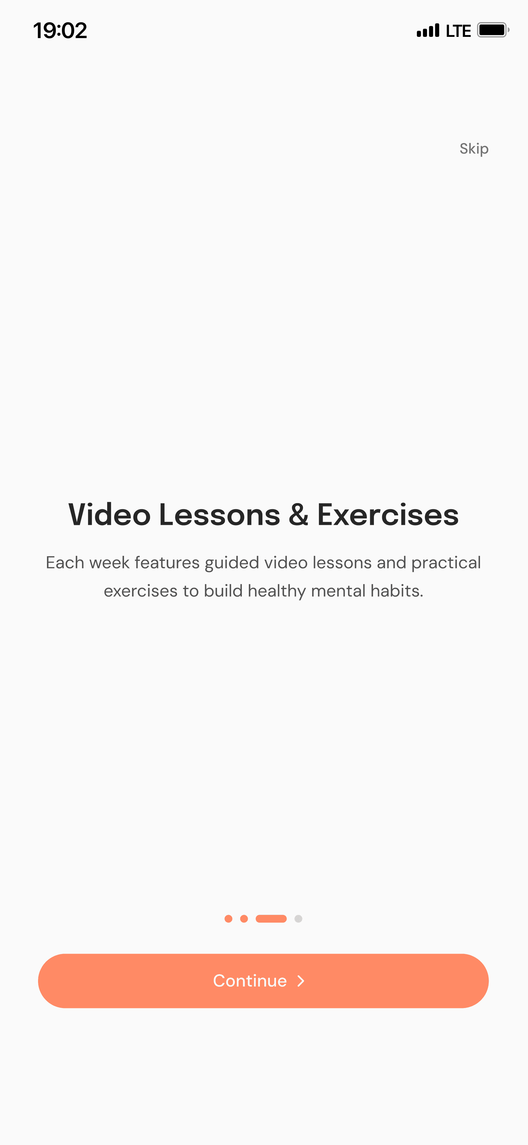
Instead of presenting all the app’s features at once, I designed onboarding to introduce MindWell’s core value through a short, structured flow.
The experience combines account setup with explanations of the wellness journey, progress tracking, educational content, and assessments.
Why this matters: New users receive context before entering the main product, helping reduce uncertainty about what the application does and how to get started.
Guided introduction
Decision 02 — Making the homepage a place to continue, not explore
The homepage brings together progress indicators, activity summaries, and access to relevant wellness content.
Rather than requiring users to navigate through multiple sections to understand their status, the dashboard provides an overview of their journey in one place.
Why this matters: The design prioritizes continuity, making it easier for returning users to understand where they are and what they can do next.
Continuity
Decision 03 — Breaking wellness education into manageable modules
Educational content is organized into individual modules featuring guided videos, comprehension checks, and assessments.
I used a consistent layout for the learning experience, with clear calls to action and visible completion states.
Why this matters: Breaking content into smaller activities creates a more approachable learning flow and provides natural opportunities for reflection.
Bite-sized learning
Decision 04 — Creating a consistent, supportive interface
I used a restrained visual language, soft coral accents, clear typography, and reusable UI patterns across the application.
Navigation, buttons, cards, and content structures follow consistent interaction conventions to make the experience easier to learn.
Why this matters: A predictable interface reduces unnecessary interaction complexity and allows users to focus on the wellness content.
Consistency
Make the first step easy
Make progress understandable
Keep users in control
Clear, supportive interactions
The solution
05 / THE FINAL EXPERIENCE
One connected journey, from onboarding to everyday engagement
Personalized onboarding
A guided entry experience that introduces the app, establishes initial user information, and explains the available wellness features.
Progress-focused home
A central dashboard with activity summaries, progress indicators, and quick access to ongoing wellness activities.
Structured learning modules
Video-based lessons, comprehension checks, and assessments that support engagement with educational content.
THE EXPERIENCE IN DETAIL
Personalized onboarding
A guided entry experience that introduces the app, establishes initial user information, and explains the available wellness features.




06 / OUTCOME & REFLECTION
From concept to a shipped product used in real-world care
MindWell progressed from an early-stage concept to a privately launched mobile application used by a licensed psychologist with their patients.
I led the end-to-end product design, delivering the core user experience across onboarding, educational modules, assessments, progress tracking, and supporting resources.
Key outcomes
Shipped product: Designed a mobile experience that progressed beyond prototypes into real-world patient use.
End-to-end ownership: Independently defined the information architecture, user flows, UX writing, and interaction patterns.
Cross-disciplinary collaboration: Worked directly with a licensed psychologist to transform expert-created lesson content into an accessible digital learning experience.
Consistent product experience: Established reusable interface patterns across the application's core features.
WHAT I LEARNED
Designing MindWell reinforced the importance of balancing simplicity, clarity, and user autonomy in wellness products.
The most valuable lesson was learning how to translate specialized domain knowledge into an approachable digital experience without oversimplifying the underlying content.
The product's private launch represents a significant milestone. Future evaluation could focus on onboarding completion, lesson engagement, and how easily patients navigate and resume their activities.
Freelance UX/UI design · Mobile app · Health & Wellness
Interested In More Projects?
Explore additional case studies showcasing my approach to user research, interaction design, and creating meaningful experiences.

