Netflix Mood Picks: From endless scrolling to one tap on how you feel.
- Role
- Product Designer, UX Researcher
- Timeline
- 3 weeks
- Tools
- Figma, FigJam, Google Forms
- Type
- Self-initiated concept
Project at a glance
Problem
Netflix recommends based on history, not current mood. Users browse for 10+ minutes and often leave without watching anything.
Solution
A one-tap mood selector that returns a single curated recommendation — the lowest possible friction, with zero added cognitive load.
Impact
92% said it felt more personal than browsing by genre, 88% would use it regularly, and 6 of 8 completed the flow without prompting.
- Felt more personal than genre browsing
- 92%
- Would use it regularly
- 88%
- Completed the flow unprompted
- 6/8
01 — The problem
History-based recommendations miss the moment
Netflix’s library is a strength that creates real friction. The algorithm surfaces what you’ve liked before — not what you’re in the mood for right now. Those are different questions.
- Spend 10+ minutes deciding what to watch
- 82%
- Left without watching due to indecision
- ~40%
Design question
How might we help users find content that matches their current mood, without adding more cognitive load to an already overwhelming experience?
02 — Competitive context
Spotify proved it. Video hasn’t caught up.
Strong precedent
Spotify
Mood playlists like “Focus” and “Chill” — users browse by feeling, not search.
Gap identified
Netflix today
“Because you watched X” is the main signal. Mood isn’t a first-class input.
Same gap
Apple TV+
Staff-picked editorial themes, but no user-driven mood input.
03 — Research
Pressure-testing the problem before designing
A Google Forms survey with 40 participants — ages 18–45, all active Netflix users.
- Spend 10+ min deciding per session
- 82%
- Say mood shapes what they watch
- 74%
- Have wanted mood-based suggestions
- 67%
- Left without watching
- ~40%
“I scroll for ages, nothing feels right, and then I just give up and go on my phone instead.”
— Survey respondent, 27 “I spend more time deciding than actually watching sometimes.”
— Survey respondent, 22
Research limitation
Convenience-based, self-selected sample — findings are directional rather than statistically representative.
04 — Ideation
What I explored, and what I cut
- Option 1Discarded
Mood wheel
Visually interesting, but users had to think too hard before getting value. Failed the cognitive-load test.
- Option 2Discarded
Multi-step questionnaire
Felt like a survey, not a feature. 3+ steps before a result was too high a barrier.
- Option 3Chosen
Tappable mood tags
One tap to start, instant feedback, native to Netflix’s visual language.
- Option 4Chosen
Single recommendation
A list reintroduces choice paralysis. One pick with “Try another” solves it.
Objective
Under 2 min
To a recommendation.
Objective
Zero added load
No new thinking required.
Objective
Native feel
Matches Netflix UI.
Objective
Easy to undo
Adjust anytime.
05 — Solution
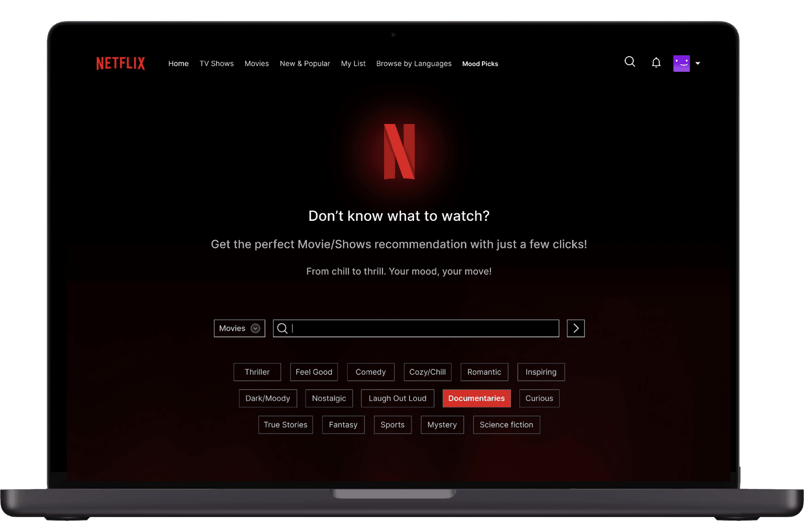
A three-step flow
- 1
Access
Via “Mood Picks” in the nav, or a “Need Ideas?” button on the home screen.
- 2
Select mood
Tap mood tags or type your own. Toggle Movies or TV Shows.
- 3
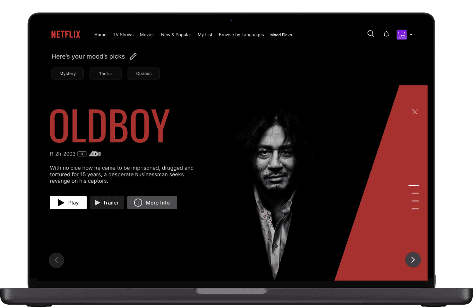
Get a pick
One curated recommendation. Play, get more info, or try another.
- D01
Two entry points
- Problem
- Indecision happens mid-browse, not when users go looking for a feature.
- Decision
- “Mood Picks” in the nav for intentional use, plus “Need Ideas?” on home.
- Why it matters
- The second entry catches users right when the problem is happening.
- D02
A short, scannable tag list
- Problem
- Too many moods recreate the overload we were fixing.
- Decision
- Tags scannable in under three seconds, with type-your-own as an escape valve. The Movies/TV toggle sits here, not on results.
- Why it matters
- Format affects what you’re in the mood for, not just what you see.
- D03
Native micro-interactions
- Problem
- If a feature feels foreign, users won’t trust it.
- Decision
- Netflix’s red hover state, one-tap tag editing, and an on-brand “N” glow loading animation.
- Why it matters
- Native patterns lower the learning curve to zero.
06 — Testing
Moderated usability testing
Moderated sessions with 8 participants using a think-aloud protocol.
- Felt more personal than browsing by genre
- 92%
- Would use it regularly if Netflix launched it
- 88%
- Completed the full flow without prompting
- 6/8
07 — Reflection
Resist the urge to add
Strongest instinct I developed
Every complex idea I explored failed because it asked users to work before they got value. The simplest version — tap a feeling, get a result — was also the one that tested best.
- Next: interviews on edge cases — users who can’t name their mood, or want to break their pattern.
- Next: test whether single-pick holds up over repeated use as novelty fades.
- Next: explore feeding mood data into recommendations without feeling intrusive.
The biggest open question is what happens at session 10, not session 1.
Self-initiated concept project. No affiliation with Netflix.